7 Tips To Improve Your Instagram Grid Layout
Your Instagram grid layout is your chance to show potential followers your vibe or brand at a glance. What message do you want to send?
Table of Contents
- What is an Instagram grid layout and why does it matter?
- 7 Instagram layout ideas
- 6 best practices for planning your Instagram layout
- 4 tools to plan your Instagram grid
Sometimes, it’s nice to take a break from endlessly scrolling through your feed—and endlessly scroll through someone’s individual Instagram page instead.
Welcome to The Grid.
Lined up in neat rows of three, each Instagram post suddenly is part of a bigger picture. A peek into a brand’s soul…or, at the very least, their content strategy.
Instagram power users know how to use this viewpoint to their advantage, with artfully planned posts that, together, create a gorgeous Instagram grid layout.
If you haven’t thought about what your own rows of squares add up to, it’s about time.
Here’s all you need to know about building an attention-grabbing Instagram grid layout to grow your following and engagement.
What is an Instagram grid layout and why does it matter?
An Instagram grid layout refers to how your own individual Instagram feed is organized. When someone follows you for the first time or navigates to your profile to check out your content, your Instagram photo grid is an opportunity to showcase your vibe or brand at a glance.
The grid gives you a birds-eye view of a user’s posting history. This is your first impression of their body of work: a visual, big-picture introduction to their personal or professional brand.
For individual users, creating a beautiful grid may not matter. Sure, color-coding your posts could be a fun personal challenge, but if you’re just on the ‘gram to connect with friends, not amass an audience, branding likely isn’t too important.
But consistency and style are critical for brands, creatives, or influencers, particularly if their accounts are focused on aesthetics or lifestyle.
After all, your grid is a quick and easy way to get your message across. Plus, anyone viewing your profile is thinking about following you. This is your chance to show exactly what you offer.
Are you avant-garde or on-trend? Will your content soothe or bring the drama? Is your brand consistent or chaotic? One look at a grid, and they’ll get the (sorry, not sorry) picture.
7 Instagram layout ideas
If you’ve never thought about getting creative with your Instagram grid layout before, we’ve got seven ideas to get you started, many of which are easy to manage even for small teams.
Read on to see examples of each one, plus how you can use it for your own feed.
1. Stick to a single color palette
This is probably the most common grid style going—not that I’m calling anyone lazy (don’t @ me!), but it really doesn’t get much easier than this.
Pick a color palette (pinks and grays?) or a certain tone (high contrast neons?) to feature in every photo. Viewed together, your gallery will look like a matching set, even if the content of your pics varies.
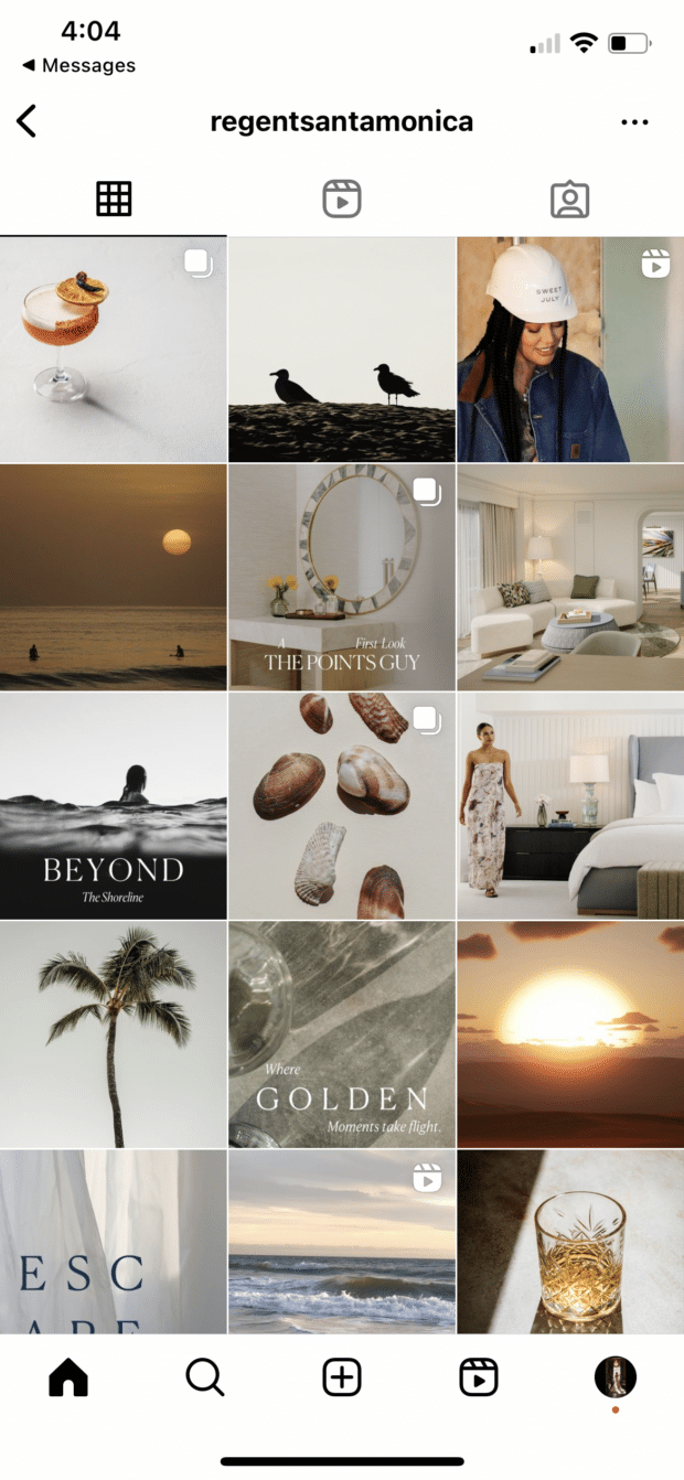
Take a look at the way @regentsantamonica has created a perfectly beachy feel by prioritizing sand-colored images throughout its feed:
However, you don’t have to have a perfectly curated setup at your office to take similar photos. One easy way to make sure your photos all speak the same visual language is simply to use the same filter for every photo to help create a consistent tone.
A variation on this theme? Using a standard filter or color palette, but also working in an “accent” color or filter every few posts, too.
Maybe your Instagram feed is mostly dreamy, sepia-toned boho fantasy, but every few rows, we see a vibrant pop of forest green. Woo! You’re playing with fire!
Here’s another example of a feed that feels well put together simply because it’s prioritizing a single color.
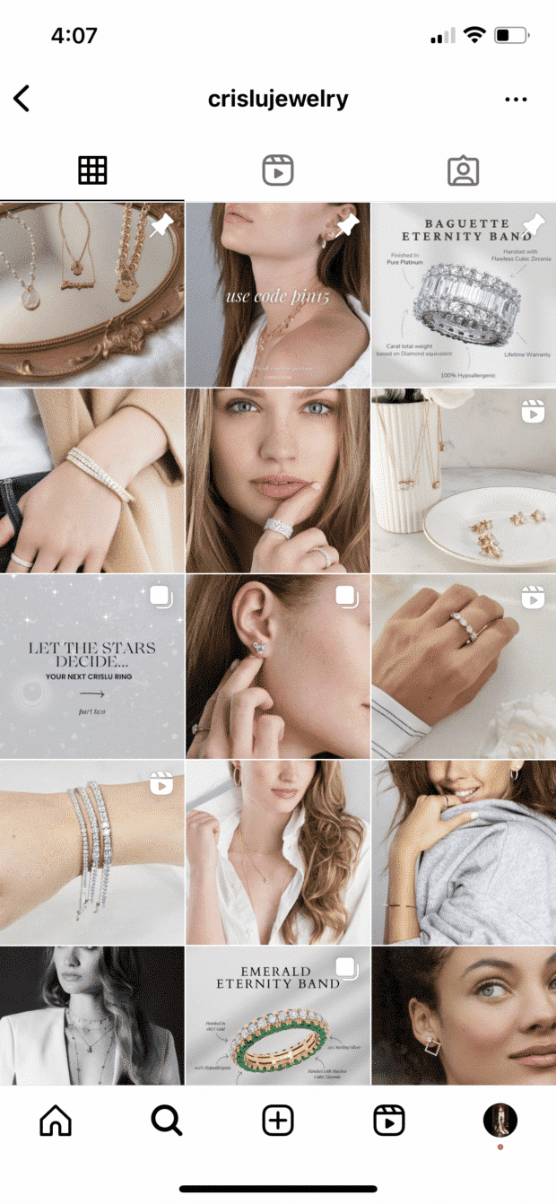
@crislujewelry’s Instagram sticks to a light silver tone, matching perfectly with its products:
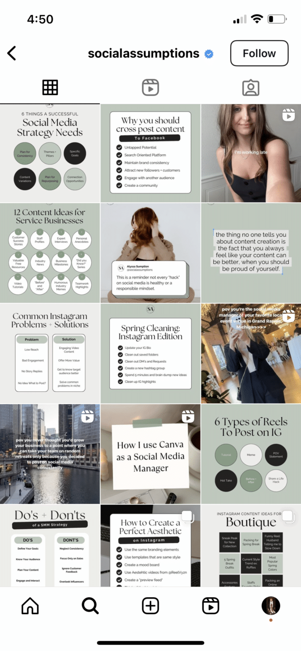
However, you don’t even have to stick fully to images. Take a look at how @socialassumptions uses graphics to pull together a cohesive, sage-green feed:
2. Create a checkerboard effect
By alternating the style of photos you post, you’ll easily create a checkerboard look on your grid. Try alternating text quotes with photography or mixing close-up shots with landscape photos. Going back and forth with two distinct colors can work, too.
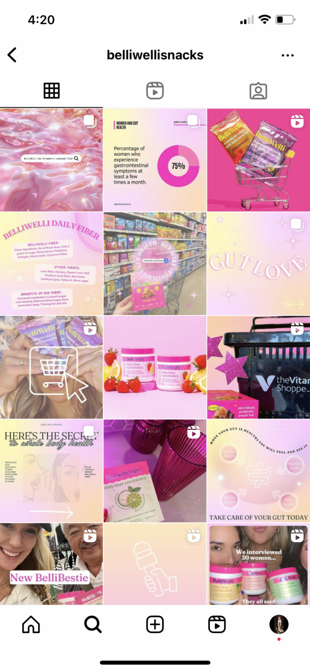
@belliwellisnacks created a visually appealing checkerboard by alternating graphics with a gradient background alongside other images, helping its feed feel intentional and put together:
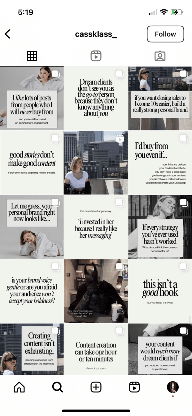
Similarly, @cassklass_ created a checkerboard effect using text graphics. Images and plain background graphics alternate to put together a stunning grid layout:
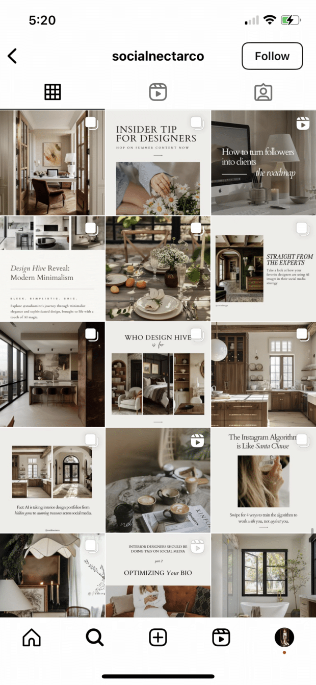
And @socialnectarco has created its own checkerboard by alternating graphics with a neutral background and full image posts:
Hot tip: if you’re using text-based posts, keep the background color or fonts consistent to really make the pattern clear. Check and mate.
(Need a little help on the graphic design front? There are tons of great tools and templates out there to create visuals that pop.)
3. Design row by row or column by column
Think outside the box…and inside the, um, row. Or column. Uniting the images on each row or column by theme or color can create a powerful impact across your feed.
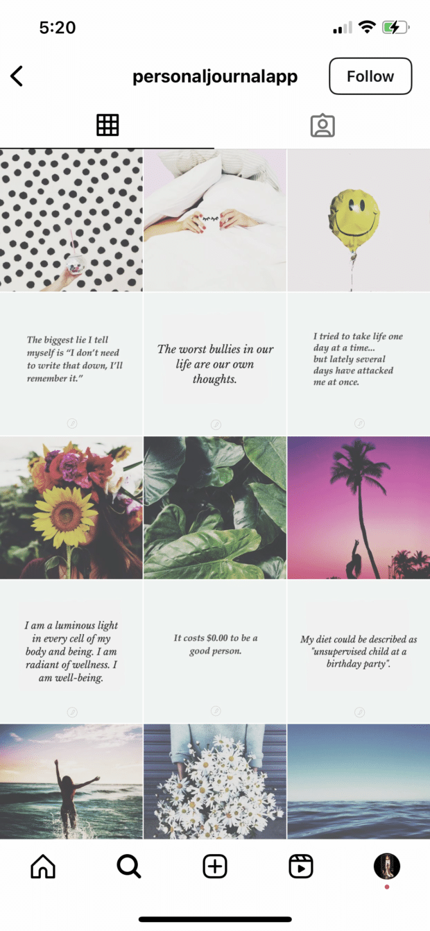
@personaljournalapp created a beautifully curated feed by alternating images and quote graphics row after row:
However, this same effect can be applied vertically, as well, focusing each column in your feed on a specific type of post.
We get a great example of this below from @theinsidescoopsocialmedia’s feed.
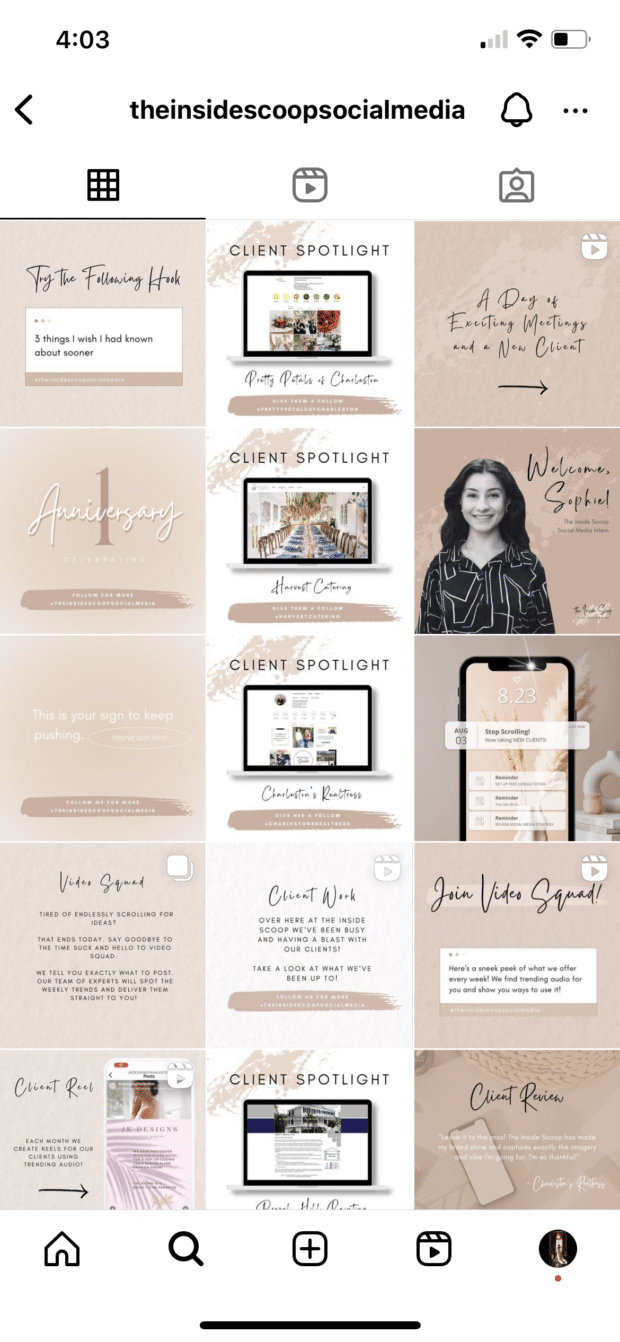
One column—typically the one sharing client spotlights to help it stand out even more—is fully white backgrounds while the others are tan backgrounds:
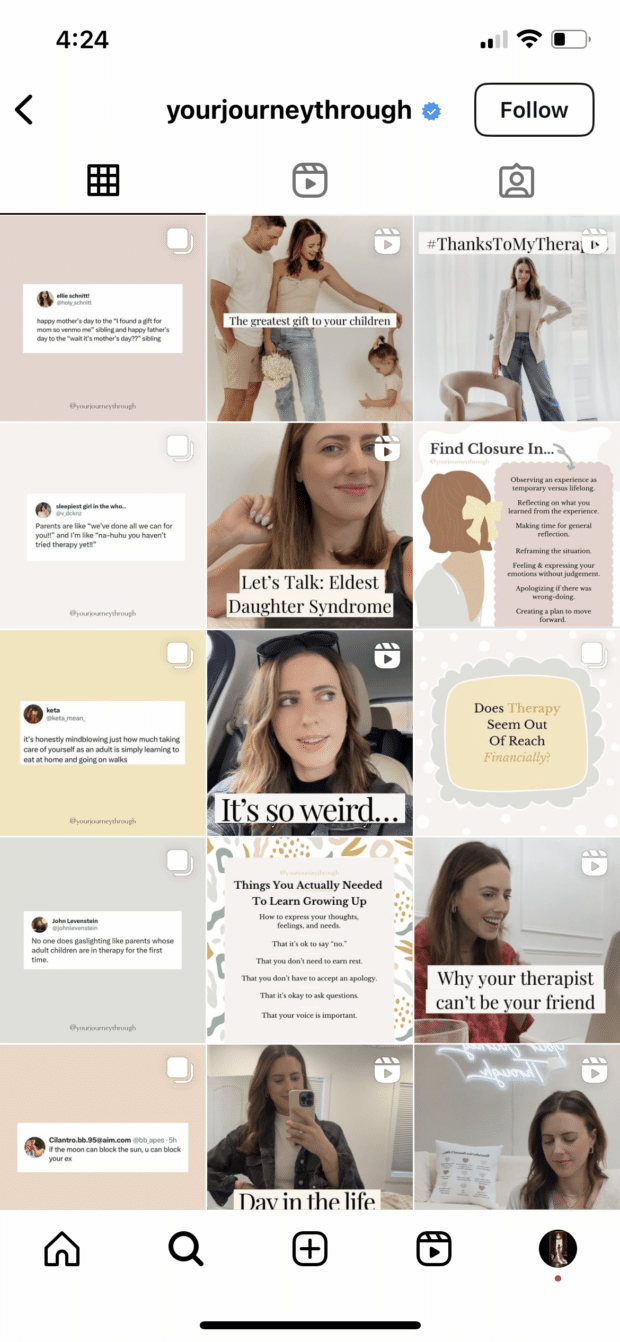
And below, on @yourjourneythrough’s feed, we see a single column dedicated to tweet graphics:
Then, for a twist, you could even recreate this in a diagonal design, like we see from @her.social below:

This type of Instagram grid layout is extremely simple to curate. Simply choose what you want each row or column to look like, then plan your content accordingly.
For a row-by-row look, you’ll post three similar photos in a row before moving on to the next design.
For a column-by-column look, you’ll post three different photos before moving on to similar versions of those three photos.
4. Let typography own your grid

5. Turn your grid into the rainbow


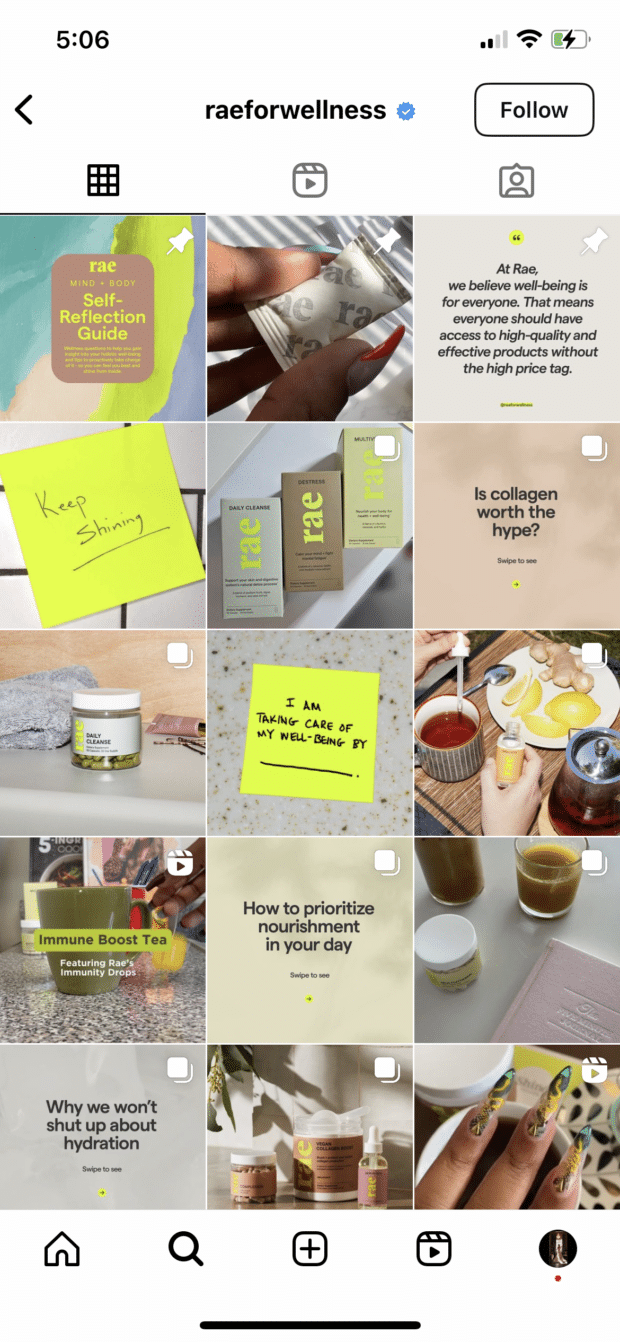
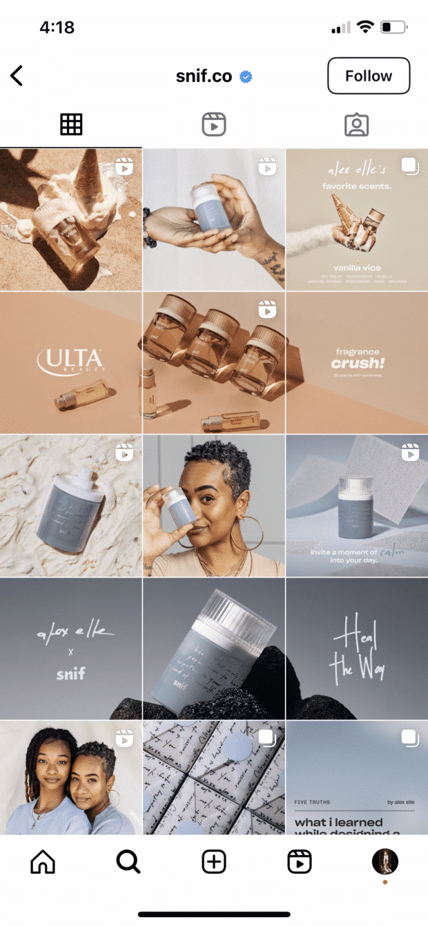
6. Embrace your brand color(s)
7. Connect your photos across borders

.png)
Comments
Post a Comment